1. Eliminate animated avatars.
2. Censor garish avatars.
3. Slim down the excessive border thickness; several connective broad planes and bars of unused colored space with numerous shading and line weights kills the enthusiasm for scrolling("travelling") that the simple, light-weight, yet immersive visual language engendered by the old forum style. All mentioned elements don't gel in a visually logical or pleasing manner and it distracts the eye. You've wrapped a focally dispersing optical illusion around the plane of textual content and it needs editing. And the MOST IMPORTANT PART is that it takes more mouse-wheel clicks to move the page and with all this extra dreary weight to move - it - is - ex-haus-t-ing!
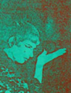
4. Those "Post Icons" are ugly as well (cLuNkY__). My eye jumps to that damn "Uncle Sam Wants YOU!" pic and I feel threatened every time...stop....looking at...pointing at me, damn it!
edit: addition
5. I realized what was making me feel queasy: too many similar shades/tones of the same two colors. Quick count is eleven shades(less the gradient panels). Subtle contrast can be indicative of refined taste but this doesn't accomplish that. Queasy. Wait, you're trying to get rid of the visually sensitive derelicts, aren't you? Just don't make the mistake of trying this configuration out in flesh tones.
Edited by liplex, 09 December 2007 - 05:09 AM.